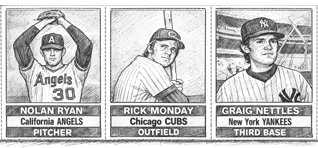
Cardboard Chronicles
The 1976 Hostess Nolan Ryan Variations
The 1976 Hostess Nolan Ryan Variations
Collecting baseball cards is, at its core, a personal pursuit. Every collector decides how deep—or how lightly—they want to wade into the hobby. Some are content with base cards. Others chase master sets. There is no right or wrong approach. The only rule is simple: collect what speaks to you.
For me, that pull has always come from variations. And in vintage collecting, variations are rarely neat or clearly documented. Unlike modern cards—with checklists, parallels, and serial numbers spelled out in advance—many vintage variations exist quietly, discovered only through careful observation, comparison, and patience.
That spirit of discovery is what led me down a deeper path with the 1976 Hostess Nolan Ryan card—a card I now believe exists in at least two legitimate variations.
A Quick Word on Hostess Cards
Before diving in, it helps to zoom out.
Hostess baseball cards were issued between 1975 and 1979 on the packaging of Hostess snack products. Licensed through Topps, they used the same photography and numbering as Topps flagship sets, but were never pack-issued. Instead, they were printed directly on boxes and panels, intended to be cut out by consumers. Importantly, Hostess advertised these cards as having player statistics on the back, a feature proudly printed on the packaging itself.
Because these cards were part of food packaging—not hobby products—their production introduces subtle differences that collectors are still uncovering decades later.
The First Clue: Background Color
While building my Nolan Ryan Hostess collection, one detail immediately stood out: the background color behind Ryan’s image.
Across multiple examples, the background tone was not consistent. Some cards showed a lighter, almost washed appearance. Others appeared noticeably darker. At first glance, this could be dismissed as printing inconsistency—but repeated examples showed these differences occurring with surprising consistency.
That raised an important question:
Were these simply print variations… or something more?
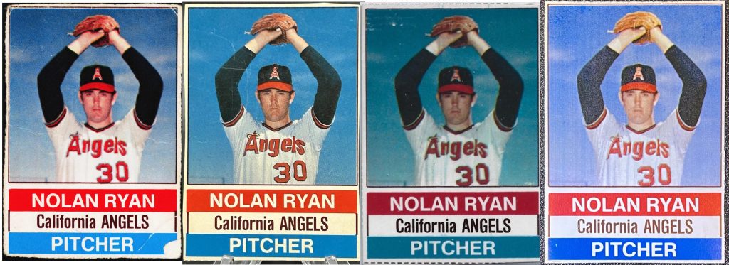
A Subtle but Telling Difference: Image Cropping
The next discovery required closer inspection.
When comparing cards side by side, I noticed a slight but repeatable cropping difference in the image itself—specifically, the positioning of the number “3” on Nolan Ryan’s jersey.
- On some cards, the “3” touches the bottom border of the image.
- On others, it does not.
This difference is subtle, but unmistakable once seen. And it raised a critical question:
Was this coincidence—or evidence of distinct production sources?
Zooming Out: The Importance of Uncut Packaging
To answer that question, we had to zoom out—literally.
Individual cards can only tell us so much. To truly understand Hostess variations, we need to examine uncut panels and complete packaging.
Three-card panels offer a partial solution, but most surviving examples have been trimmed tightly along the cut lines, removing important contextual clues. Occasionally, however, panels surface with extra packaging intact—and those are invaluable.
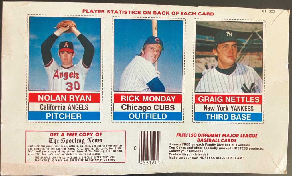
Immediately, one detail jumps out:
PLAYER STATISTICS ON BACK OF EACH CARD
This text—printed above the images—is our first hard anchor. Hostess packaging was highly consistent in layout and design within a given product. That consistency allows us to use text placement as a diagnostic tool.
The Breakthrough: Text Placement Differences
When a second panel surfaced, another crucial difference became apparent.
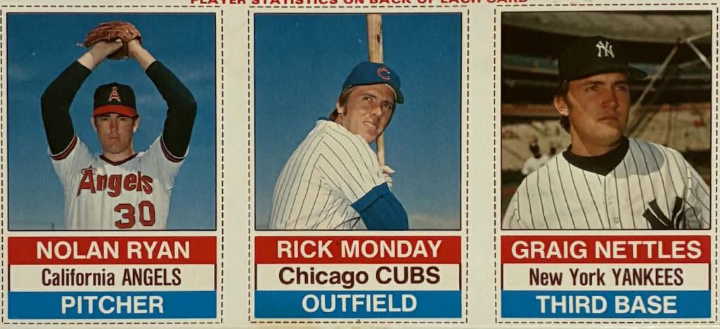
Comparing the two panels side by side, the placement of the “PLAYER STATISTICS ON BACK OF EACH CARD” text clearly differs. This is not random. Hostess did not shift text placement arbitrarily within the same product.
That alone strongly suggests two different Hostess products using Nolan Ryan’s image.
But the most compelling confirmation comes when we return to the image itself:
the positioning of the “3” relative to the bottom border aligns perfectly with the differing panel layouts.
At this point, the conclusion becomes unavoidable:
These are not accidental print differences—they are product-driven variations.
The Final Piece: Identifying the Products
The last question, then, is straightforward:
Which products did these variations come from?
The answer comes from examining complete, intact Hostess boxes.
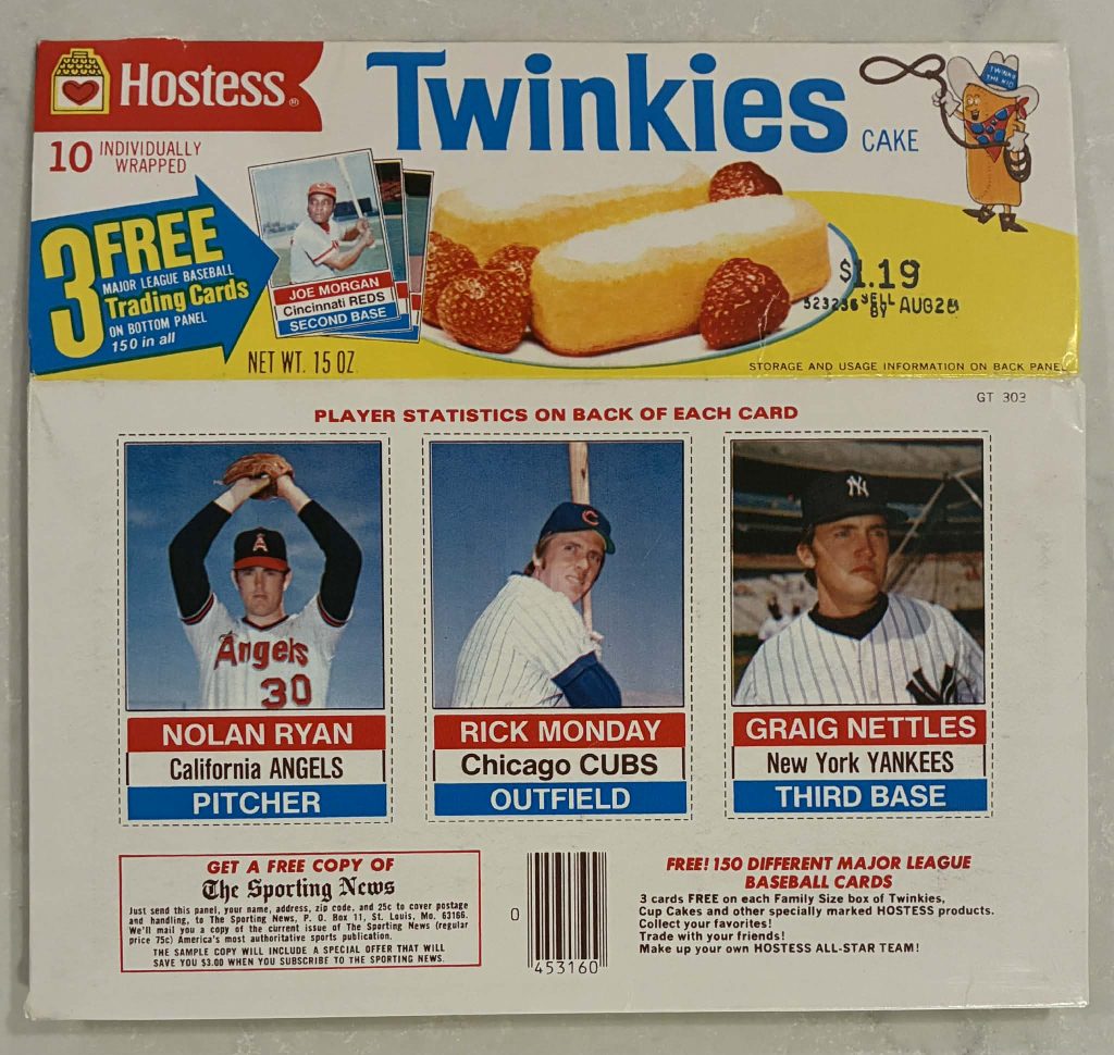
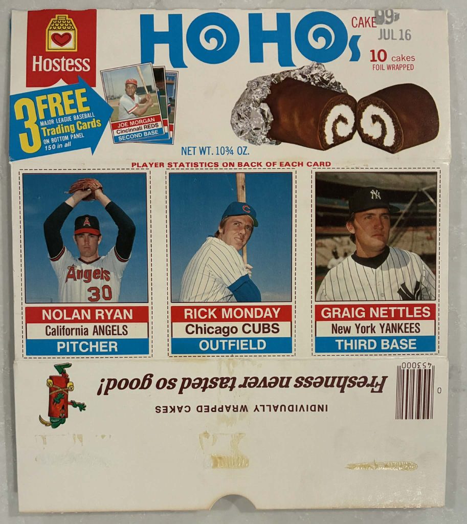
The above images were graciously provided by The Bracken Collection!
At this level, everything clicks into place.
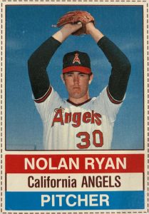
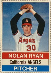
- Ho Hos packaging features the Nolan Ryan image where the “3” does not touch the bottom border.
- Twinkies packaging features the image where the “3” does touch the bottom border.
The cropping variations and packaging text alignment all resolve into a single, coherent explanation: two distinct Hostess products, two distinct image variations.
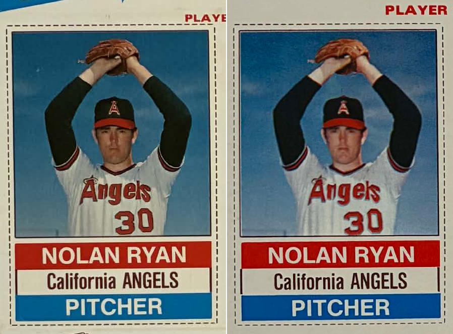
Ho Ho’s on the left, Twinkies on the right!
Why This Matters
If you’ve read this far, you’re likely someone who enjoys understanding not just what a card is—but where it came from.
Through careful comparison of uncut panels and complete Hostess packaging, we can confidently identify at least two distinct product-based image variations of the 1976 Hostess Nolan Ryan card. Differences in image cropping and packaging layout are not accidental; they point directly to separate Hostess products and separate production sources.
What remains unresolved—and just as important—is the question of background color variation.
At this point, we have not identified a definitive explanation for the color differences seen across surviving examples. These may simply be the result of normal printing inconsistencies, ink density fluctuations, or production runs across different facilities. They may also point to additional nuances in the printing process that have yet to be fully documented.
For now, that question remains open.
And that’s part of what makes vintage collecting so compelling. Not every answer arrives neatly packaged. Some require time, more examples, and more eyes willing to look closely.
This page represents a step forward—not a final word. If you’ve observed additional color variations, own complete 1976 Hostess packaging, or have insight into Hostess printing practices, your contributions are welcome. This is how understanding grows in the hobby: through shared research, careful restraint, and a willingness to leave some questions unanswered until the evidence catches up.